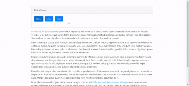
Offering pre-built themes like a “Dark mode” is now so common in many popular sites like Twitter, Facebook, etc. The main selling point of these are to offer display styles that does not hurt eyes when one spends a lot of time on your site and at the same time provides some alternate cool looks. This made me wonder how easy it is to implement custom themes using Angular and Bootstrap. Turns out it is easy and I created a simple application called ThemePicker to demonstrate this.
The main requirement for implementing custom themes is to have a base theme written in SASS that is customisable. Hence, I picked Bootstrap for this post which allows customisation in a SASSy way. As long as the base theme, not necessarily bootstrap, uses variables with defaults, it is easy to customise themes. The point of this blog post is to see how we can load customized themes in an Angular application. You can access the full source code in GitHub.
Option 1: Loading themes on startup
Easy way to create and load custom themes is to simply override the defaults and load these as part of the main stylesheet. For example, in below screenshot we create three themes – default, light and dark.
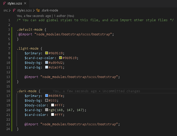
Bootstrap has default values for variables like “$primary”. We are simply providing initial values for these variables so that the SASS compiler will use the ones provided by us to create the final CSS stylesheet. This way we do not have to provide CSS rules to change the color of every component one by one like for buttons, links, etc. It is not required to have all themes in styles.scss file. In fact, it is good to keep themes in separate SCSS files and import those SCSS files in styles.scss.
Now, we just need to have the code to apply the right CSS class on ‘html’ element when user selects a particular theme, as shown below.
import { Component, Renderer2, OnInit } from '@angular/core';

@Component({
  selector: 'app-root',
  templateUrl: './app.component.html',
  styleUrls: ['./app.component.scss']
})
export class AppComponent implements OnInit {
  title = 'theme-picker';
  currentTheme = 'default-mode';

  constructor(private renderer: Renderer2) {
 }

  ngOnInit(): void {
    this.renderer.addClass(document.body.parentElement, 'default-mode');
  }

  applyDefaultTheme() {
    this.applyTheme('default-mode');
  }

  applyLightTheme() {
    this.applyTheme('light-mode');
  }

  applyDarkTheme() {
    this.applyTheme('dark-mode');
  }

  applyTheme(themeName: string) {
    if (this.currentTheme !== themeName) {
      // remove current theme from html element and apply the selected theme
      this.renderer.removeClass(document.body.parentElement, this.currentTheme);
      this.renderer.addClass(document.body.parentElement, themeName);
      this.currentTheme = themeName;
    }
  }
}
It is this easy to override default values in a base theme and load these at runtime. However, this solution is not ideal when we are really overriding a big base theme like Bootstrap. In my testing using Bootstrap 4.5.0, I found that each theme adds another 180Kb to the stylesheet size. This is not a good solution if you have more then 2 or 3 custom themes and if you are likely to publish front end changes frequently. This takes us to Option 2.
Option 2: Loading themes on demand
Once we have created custom themes in SASS, our best solution (GitHub: ThemePicker) is to load these only when a user wants to check the custom ones. Moreover, users are not on our site to play around with the themes and therefore, there is no reason why we should load the custom themes every time a user visits our site.
In order to do this, we will just import default theme in our styles.scss. The other themes will be imported programmatically. The key change to implement this idea lies in angular’s “build” configuration in angular.json file. We need to update the styles configuration to generate separate CSS stylesheets for our custom themes and not to inject these by default.

In the above configuration, we are creating three stylesheets during build – styles.css, theme-dark-mode.css and theme-light-mode.css. Only styles.css will be loaded when a user visits our site first time and this will only contain the “default-mode” theme.
In our theme picker component, the main change is done in the logic to apply the theme. This is shown below.
  applyTheme(themeName: string) {
    if (this.currentTheme !== themeName) {

      // default theme is not generated separately but it is part of the main styles.scss.
      if (themeName !== 'default-mode') {
        if (environment.production) {
          let stylesheetLink = this.renderer.createElement('link');
          stylesheetLink.rel = 'stylesheet';
          stylesheetLink.href = `theme-${themeName}.css`;
          this.renderer.appendChild(document.body, stylesheetLink);
        }
        else { // in dev environment styles are always generated as .js files for performance reasons
          let stylesheetLink = this.renderer.createElement('script');
          stylesheetLink.src = `theme-${themeName}.js`;
          this.renderer.appendChild(document.body, stylesheetLink);
        }
      }


        // Remove current theme from html element and apply the selected theme
        // Removing css class could cause a flickering effect on screen, if this happens before
        // the stylesheet is downloaded. Therefore, trigger the logic after a safe time interval
      setTimeout(() => {
        this.renderer.removeClass(document.body.parentElement, this.currentTheme);
        this.renderer.addClass(document.body.parentElement, themeName);
        this.currentTheme = themeName;
      }, 500);
    }
  }
In order to dynamically load the stylesheet, we create a “link” element and then specify the source based on the theme selected. Once we have loaded the stylesheet, we can apply the right CSS class as before. You might have noticed that we have some additional code for “development” environment. This is needed because angular does not create CSS files in development build or when we do “serve” but the SASS files are compiled to javascript files.
 Martin's Blog